Cards require a small amount of markup and classes to provide you with as much
control as possible. These classes
and markup are flexible though and can typically be remixed and extended with ease. For example, if your
card has no flush content like images, feel free to put the .card-content class on the
.card
element to consolidate your markup.

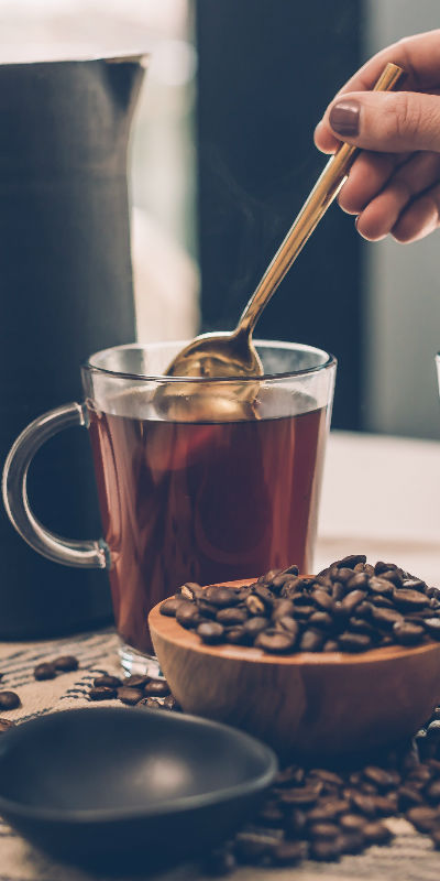
Icing powder caramels macaroon. Toffee sugar plum brownie pastry gummies jelly.
Go somewhere


Card title
Sweet halvah dragée jelly-o halvah carrot cake oat cake. Donut jujubes jelly chocolate cake.
Go somewhereCards with horizontal image.
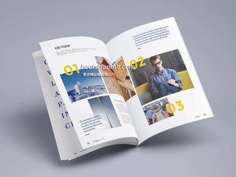
Overlap Image Cards
New Arrival
Donut toffee candy brownie soufflé macaroon.
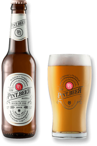
Brand Minute
Donut toffee candy brownie soufflé macaroon.

Brand Minute
Donut toffee candy brownie soufflé macaroon.
Weekly weather cards.


Cards include their own variant classes for quickly changing the
background-color
and border-color of a card. Darker colors require the use of .card-inverse.
Cards
include a class for quickly
toggling the text color. By default, cards use dark text and assume a light background. Add
.card-inverse
for white text and specify the background-color and border-color to go with it.
You can also use .card-inverse with the contextual backgrounds variants.
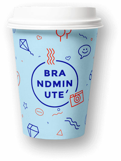
Brand Minute
Donut toffee candy brownie soufflé macaroon.
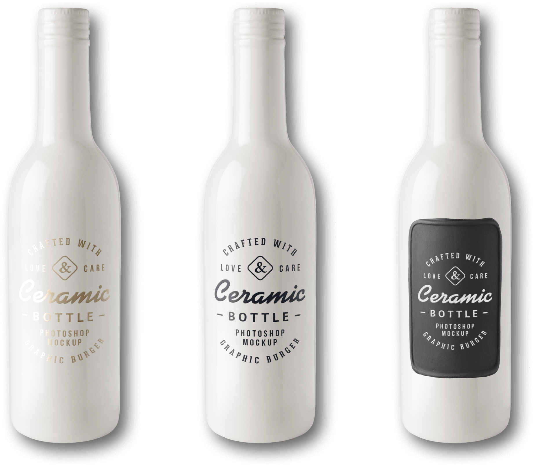
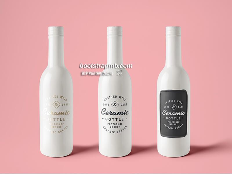
Ceramic Bottle
456 items
Brand Minute
Donut toffee candy brownie soufflé macaroon.
New Arrival
Donut toffee candy brownie soufflé macaroon.
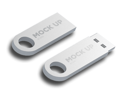
Storage Device
945 items
New Arrival
Donut toffee candy brownie soufflé macaroon.
In need of a colored card, but not the hefty background colors they bring? Replace
the default modifier classes
with the .card-outline-* ones to style just the border-color of a card.
Brand Minute
Donut toffee candy brownie soufflé macaroon.
Ceramic Bottle
456 items
Brand Minute
Donut toffee candy brownie soufflé macaroon.
New Arrival
Donut toffee candy brownie soufflé macaroon.
Storage Device
945 items
New Arrival
Donut toffee candy brownie soufflé macaroon.
Use card groups to render cards as a single, attached element with equal width and
height columns. By default,
card groups use display: table; and table-layout: fixed; to achieve their uniform
sizing. However, enabling flexbox mode can switch that to use display: flex; and provide the
same effect.
Card title
This card has supporting text below as a natural lead-in to additional content.
Card title
This card has supporting text below as a natural lead-in to additional content.
Card title
This card has supporting text below as a natural lead-in to additional content.

Card title
This card has supporting text below as a natural lead-in to additional content.
Need a set of equal width and height cards that aren’t attached to one another? Use
card decks. By default, card
decks require two wrapping elements: .card-deck-wrapper and a .card-deck. We use
table styles for the sizing and the gutters on .card-deck. The .card-deck-wrapper is
used to negative margin out the border-spacing on the .card-deck.
Card title
This card has supporting text below as a natural lead-in to additional content.
Card title
This card has supporting text below as a natural lead-in to additional content.
Card title
This card has supporting text below as a natural lead-in to additional content.
Card title
This card has supporting text below as a natural lead-in to additional content.
Cards can be organized into Masonry-like columns with just CSS by wrapping them in
.card-columns.
Only applies to small devices and above.
Heads up! This is not available in IE9 and below as they have no support
for the column-* CSS properties.
Card title
Some quick example text to build on the card title and make up the bulk of the card's content.
Go somewhere
Brand Minute
Donut toffee candy brownie soufflé macaroon.
Storage Device
945 items
Ceramic Bottle
456 items
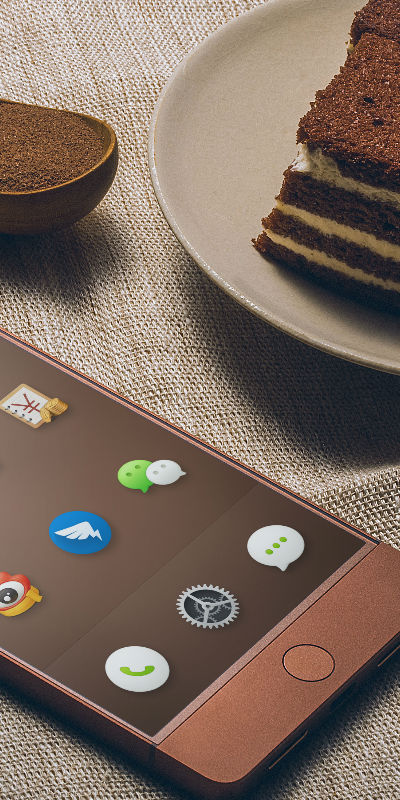
Bottom Image Cap
Jelly-o sesame snaps cheesecake topping. Cupcake fruitcake macaroon donut pastry gummies tiramisu chocolate bar muffin. Dessert bonbon caramels brownie chocolate bar chocolate tart dragée.
Cupcake fruitcake macaroon donut pastry gummies tiramisu chocolate bar muffin.
Last updated 3 mins ago

New Arrival
Donut toffee candy brownie soufflé macaroon.