Hello, Welcome here
Cards With Images
This is 3 column contents

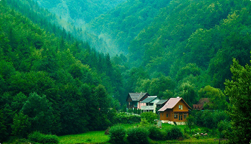
Card title
This is a wider card with supporting text and below as a natural lead-in to the additional content. This content is a little bit longer.
Last updated 3 mins ago
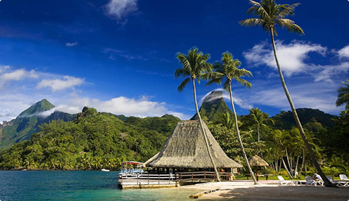
Card title
This is a wider card with supporting text and below as a natural lead-in to the additional content. This content is a little bit longer.
Last updated 3 mins ago
Card title
This is a wider card with supporting text and below as a natural lead-in to the additional content. This content is a little bit longer.
Last updated 3 mins ago
Cards With Footer and Links
This is 3 column contents
Card title
This is a wider card with supporting text and below as a natural lead-in to the additional content. This content is a little bit longer.
Card title
This is a wider card with supporting text and below as a natural lead-in to the additional content. This content is a little bit longer.
Card title
This is a wider card with supporting text and below as a natural lead-in to the additional content. This content is a little bit longer.
Cards With Header, Footer and Links
This is 3 column contents
Card title
Card subtitle
This is a wider card with supporting text and below as a natural lead-in to the additional content. This content is a little bit longer.
Card title
Card subtitle
This is a wider card with supporting text and below as a natural lead-in to the additional content. This content is a little bit longer.
Card title
Card subtitle
This is a wider card with supporting text and below as a natural lead-in to the additional content. This content is a little bit longer.
Cards With Button
This is 3 column contents
Card title
This is a wider card with supporting text and below as a natural lead-in to the additional content. This content is a little bit longer.
Go somewhereCard title
This is a wider card with supporting text and below as a natural lead-in to the additional content. This content is a little bit longer.
Go somewhereCard title
This is a wider card with supporting text and below as a natural lead-in to the additional content. This content is a little bit longer.
Go somewhereCards Types
The building block of a card is the .card-body. Use it whenever you need a padded section within a card.
Card title
Card subtitle
This is a wider card with supporting text and below as a natural lead-in to the additional content. This content is a little bit longer.
Last updated 3 mins ago
Card linkCard title
This is a wider card with supporting text and below as a natural lead-in to the additional content. This content is a little bit longer.
Special title treatment
With supporting text below as a natural lead-in to additional content.
Go somewhereHeader and footer
Add an optional header and/or footer within a card.
Special title treatment
With supporting text below as a natural lead-in to additional content.
Go somewhereLorem ipsum dolor sit amet, consectetur adipiscing elit. Integer posuere erat a ante.
Card with alignment
You can quickly change the text alignment of any card—in its entirety or specific parts—with our text align classes
Special title treatment
With supporting text below as a natural lead-in to additional content.
Go somewhereSpecial title treatment
With supporting text below as a natural lead-in to additional content.
Go somewhereSpecial title treatment
With supporting text below as a natural lead-in to additional content.
Go somewhereCard with Navigation
Add some navigation to a card’s header (or block) with Bootstrap’s nav components
Special title treatment
With supporting text below as a natural lead-in to additional content.
Go somewhereSpecial title treatment
With supporting text below as a natural lead-in to additional content.
Go somewhereCard with Image Top, Bottom and Overlay
Add some navigation to a card’s header (or block) with Bootstrap’s nav components
Card title
This is a wider card with supporting text below as a natural lead-in to additional content. This content is a little bit longer.
Last updated 3 mins ago
Card title
This is a wider card with supporting text below as a natural lead-in to additional content. This content is a little bit longer.
Last updated 3 mins ago

Card Styles with Background and color
Add some navigation to a card’s header (or block) with Bootstrap’s nav components
Primary card title
Some quick example text to build on the card title and make up the bulk of the card's content.
Go somewhereSecondary card title
Some quick example text to build on the card title and make up the bulk of the card's content.
Go somewhereSuccess card title
Some quick example text to build on the card title and make up the bulk of the card's content.
Go somewhereDanger card title
Some quick example text to build on the card title and make up the bulk of the card's content.
Go somewhereWarning card title
Some quick example text to build on the card title and make up the bulk of the card's content.
Go somewhereInfo card title
Some quick example text to build on the card title and make up the bulk of the card's content.
Go somewhereLight card title
Some quick example text to build on the card title and make up the bulk of the card's content.
Go somewhereDark card title
Some quick example text to build on the card title and make up the bulk of the card's content.
Go somewhereCard Styles with Border color
Add some navigation to a card’s header (or block) with Bootstrap’s nav components
Primary card title
Some quick example text to build on the card title and make up the bulk of the card's content.
Go somewhereSecondary card title
Some quick example text to build on the card title and make up the bulk of the card's content.
Go somewhereSuccess card title
Some quick example text to build on the card title and make up the bulk of the card's content.
Go somewhereDanger card title
Some quick example text to build on the card title and make up the bulk of the card's content.
Go somewhereWarning card title
Some quick example text to build on the card title and make up the bulk of the card's content.
Go somewhereInfo card title
Some quick example text to build on the card title and make up the bulk of the card's content.
Go somewhereLight card title
Some quick example text to build on the card title and make up the bulk of the card's content.
Go somewhereDark card title
Some quick example text to build on the card title and make up the bulk of the card's content.
Go somewhereMixins utilities
You can also change the borders on the card header and footer as needed, and even remove their background-colorwith .bg-transparent.
Success card title
Some quick example text to build on the card title and make up the bulk of the card's content.
Card Groups
You can also change the borders on the card header and footer as needed, and even remove their background-colorwith .bg-transparent.
Card title
This is a wider card with supporting text below as a natural lead-in to additional content. This content is a little bit longer.
Last updated 3 mins ago
Card title
This card has supporting text below as a natural lead-in to additional content.
Last updated 3 mins ago
Card title
This is a wider card with supporting text below as a natural lead-in to additional content. This card has even longer content than the first to show that equal height action.
Last updated 3 mins ago
When using card groups with footers, their content will automatically line up.
Card title
This is a wider card with supporting text below as a natural lead-in to additional content. This content is a little bit longer.
Card title
This card has supporting text below as a natural lead-in to additional content.
Card title
This is a wider card with supporting text below as a natural lead-in to additional content. This card has even longer content than the first to show that equal height action.
Card decks
Need a set of equal width and height cards that aren’t attached to one another? Use card decks.
Card title
This is a longer card with supporting text below as a natural lead-in to additional content. This content is a little bit longer.
Last updated 3 mins ago
Card title
This card has supporting text below as a natural lead-in to additional content.
Last updated 3 mins ago
Card title
This is a wider card with supporting text below as a natural lead-in to additional content. This card has even longer content than the first to show that equal height action.
Last updated 3 mins ago
Just like with card groups, card footers in decks will automatically line up.
Card title
This is a wider card with supporting text below as a natural lead-in to additional content. This content is a little bit longer.
Card title
This card has supporting text below as a natural lead-in to additional content.
Card title
This is a wider card with supporting text below as a natural lead-in to additional content. This card has even longer content than the first to show that equal height action.